 This is an example of a univariate choropleth map; the only measurement is of population density (people/sq. mile) in the desired area.
 Friday, August 8, 2008
Univariate choropleth
This is an example of a univariate choropleth map; the only measurement is of population density (people/sq. mile) in the desired area. Continuously variable proportional circle
 This is an example of a continuously variable proportional circle; the symbols depict the ratio of Internet Users in 2004 Europe.
http://www.geog.ucsb.edu/~jeff/gis/proportional_symbols_files/map2.jpg
Classed choropleth

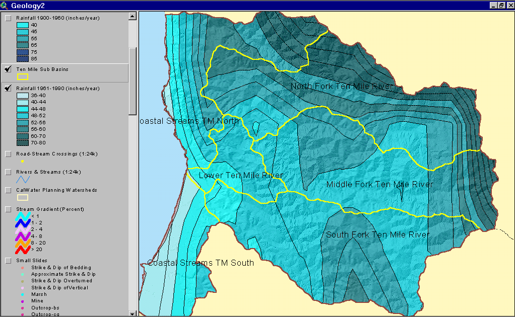
This map is a classed choropleth, but it is not areally averaged or standardized in any way. The intervals are the unit being measured.
Isopleth
 An isopleth is a feature of meteorological charts, connecting points which have an equal value of some variable at a given time and spatial area. The particular variables shown on a given chart may include values such as pressure, temperature, wind speed, etc. They are used to assist in visualizing the general features of a meteorological "field" (http://en.wikipedia.org/wiki/Isopleths)
Isohyets
 Isohyets are lines of equal precipitation, depicted in millimeters.
http://www.ecohydrology.uwa.edu.au/?f=192830
Isotachs
 This map shows isotachs, lines on a given surface connecting points with equal wind speed, together with isobars, the line of equal atmospheric pressure.
 Isobars
 Isobars are lines of equal air pressure; winds are stronger where lines are closest together.
http://z.about.com/d/german/1/0/1/J/aWetteurfronts.jpg
Bilateral graph
 This graph depicts two related variables, trade between China and Africa, with the total amount of trade between the two shown on the right.
http://www.cieca.org.tw/DB/english/gui/bil/africa/trade_africa_graph.gif
Starplot
 Starplots measure multivariate datas sets. In this visualization, the measurement is a 2000 U.S. Census bedroom query between NY & NJ.
http://www.lri.fr/~elm/media/datameadow-1.png
Correlation matix
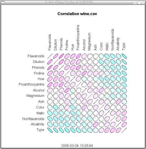
The correlation matix represents the relationship between two or more variables, but does not not imply causation.
Similarity matrix
 This example of a similarity matrix represents biomedical research. I have no idea what it means, but I liked the way it appears.
http://www.biomedcentral.com/content/figures/1471-2164-8-353-5.jpg
Stem and leaf

The stem and leaf plot is used to collect data and examine its distribution. Stem and Leaf Displays show integers along a vertical axis, units of which are shown on the other side of the same axis. This maintains the integrity of the original data when all values cannot be expressed along the axis.
Box plot

A box plot displays a simple graphical summary of a set of data. It shows a measure of central location, the average, and measures of dispersion. The example summarizes employee salaries of men and women by salary grade.
Histogram
 Histograms measure data on an interval scale. In this example salaries are being measured by the number of employees in the company.
http://www.statcan.ca/english/edu/power/ch9/images/histo2.gif
Parallel coordinate graph
 In the parallel coordinate graph, each variable is graphed on a vertical axis. The data are connected to a set of points, one on each axis. This visualization is a parallel coordinate view of a firewall log file.
http://www.secviz.org/files/images/fw_parallel_coords_selected.preview.JPG
Wind rose
 A wind rose is an example of a circular plot. In this representation wind direction and speed are depicted by color interval.
http://www.mathworks.com/matlabcentral/files/17748/wind_rose.png
Climograph
 Climographs represent the relation between temperature and precipitation over a period of time, in this case eighteen months. This representation is for Brazil, where they received the most precipitation during the coolest months.
http://www2.volstate.edu/kbell/BrazilClim.jpg
Population pyramid
 Population pyramids display age and gender distributions for a given region. This pyramid depicts HIV/AIDS for East and Southern Africa. "HIV/AIDS-induced mortality is altering population structures, with 'chimneys' replacing pyramids in the hardest-hit countries."
http://www.ifad.org/operations/regional/pf/figure1.gif
Scatter plot
 A scatter plot is a simple visualization, depicting correlations between features, their interactions, and predictive value. This is an example of a scatter plot for heart disease data.
http://www.ailab.si/janez/scatterplot.png
Index value plot
 In this plot, the index value, woodland vegetation, is being plotted against an absolute number over time with remotely sensed data. When comparisons are made, the closer to "0" the better the condition.
http://www.cmis.csiro.au/rsm/research/remveg/FIG9.jpg
Accumulative line graph or Lorenz curve
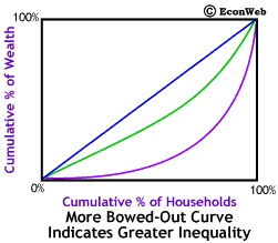 The Lorenz curve is a graphical device used to represent distributional inequality. I like this graph because it is animated.
http://www.econweb.com/texts/current/Mansions/Lorenz-compare-ani.gif
DOQQ
 This is a digital orthoquarter quad, which is a georectified raster image developed from aerial photos, in this case in black and white although it could have been in false color. I liked that it is from a site for the CA Dept. of Conservation, and the arrow points to their headquarters. The undated article states, in part "Last July, DOC purchased 21 digital linear tapes in a format called UNIX TAR from the U.S. Geological Survey for $28,000 " the cost of reproduction. The tapes contained 10,289 DOQQs, comprising a highly detailed computerized map covering most of the state.
http://www.conservation.ca.gov/index/PublishingImages/You_are_here.jpg
DEM

This example of a digital elevation model of the main Hawaiian Islands is "Individual quad DEM's were converted to a common projection, datum, and vertical unit, then mosaicked together." I think it is a really great visualization of the Islands.
DLG
 This digital line graph, a street map my Mapquest, is actually an interactive map presented by a property management company renting homes. When following links the viewer will be directed to the property.
http://www.dlgmanagement.com/images/dlg_map.jpg
DRG
 This is an example of a digital raster graphic; a scanned and georectified topoquad.
 A stereoscope is used for observing the smallest object in three-dimensional detail.
Statistical map
 This is a statistical map used for giving the probability of strong shaking at any location in CA within the next 24 hours. It is time-dependent, updates every 15 minutes, and with each tremor recorded, that event will change the statistical model for that area, increasing the chance of an aftershock.
Cartographic animation

Those of us that remember the Indonesian tsunami might find this visualization interesting, if not fascinating. It certainly makes the scope more understandable.
Flow map
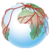 This really unique visualization represents the UK's interdependence. "Cartographers have long used flow maps to show the movement of objects from one location to another, such as the number of people in a migration, the amount of goods being traded, or the number of packets in a network. The advantage of flow maps is that they reduce visual clutter by merging edges."
Cartogram
 This example of a cartogram is of the Congressional districts of the U.S. The site had another, b&w, and represented by lines, but this one was far more interesting.
http://www.ncgia.ucsb.edu/projects/Cartogram_Central/images/districts/congressional_districts.jpg
Black and White aerial
 This image is one from the U.S. Army Corps of Engineers projects in St. Paul, MN. "The Upper Mississippi River system is a valuable natural resource to Minnesota and other States of the region. Pool 2 represents a significant corridor of open space, aquatic areas and floodplain forests that provide important and unique habitats in an urban, suburban and rural setting for both aquatic and terrestrial plants and animals."
Bivariate choropleth
 This maps appears to be a unique way to experience various research of choropleth maps called choroscope. The site has detailed instructions on how to use the tool, and to view in univariate as well.
http://www.mgm.fr/images/Choro/Chor20_eng.jpeg
Standardized choropleth
 This world map is a standardized choropleth with four intervals. Frankly, it caught my attention because of the unusual color choice.
http://www.bbc.co.uk/scotland/education/bitesize/standard/img/geography/population/g156.gif
Thursday, August 7, 2008
Classed choropleth

This map exemplifies a classed choropleth with four classes, created by natural breaks, counties. It is not areally averaged or standardized.
Dot density
 The red dots on this map represent the address of a recipient of federal farm subsidies. The big red dots signify those receiving over $250,000 a year. Closer inspection will reveal this is a map of Manhattan, NY, not known for its agriculture.
 http://matthewyglesias.theatlantic.com/NYsubsidies.jpg
Propaganda
 This interesting propaganda map of China depicts the country as an island, when it actually neighbors with fourteen other countries. However, China's politics would seem to isolate the country, or insulate, depending upon one's point of view.
 (June 18, 2008
292 - China As An Island Filed under: Uncategorized — strangemaps @ )
http://images.google.com/imgres?imgurl=http://history.sandiego.edu/gen/maps/1900s/1942world4000.jpg&imgrefurl=http://strangemaps.wordpress.com/&h=2832&w=3972&sz=1279&hl=en&start=13&tbnid=IIty6iEqqGDaKM:&tbnh=107&tbnw=150&prev=/images%3Fq%3Dpropoganda%2Bmaps%26gbv%3D2%26hl%3Den%26sa%3DG
Hypsometric
 This example of a hypsometric map of Canada caught my attention because I have never really paid very much attention to elevation of the country as a whole. When viewing this representation, instead of just seeing our large neighbor to the north, I see it as a far more topographically diverse opportunity to explore.
http://www.trailcanada.com/images-maps/canada-map-relief.jpg
PLSS
 This is an example of PLSS Townships that intersect Forest Service lands in the Southwest Region. The Lambert conformal conic projection was used due to the east-west trending. http://www.fs.fed.us/r3/gis/images/r3_townships.gif
Cadastral
 The cadastral map example for this purpose was for travel. The design allowed for visualization of the campus and surrounding streets for travel.
http://www.physics.otago.ac.nz/research/ice/igs/Venue_CampusMap_annotated2.jpg
Thematic
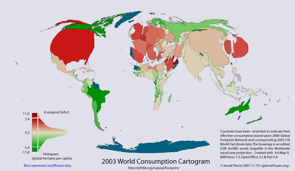 The theme of this cartographic representation is visualizing ecological footprints of nations. Red represents deficit and green represents reserve. Blue is missing data, and countries appear normal size as if in ecological balance. These type maps help gain attention to a cause by their startling expressions of differences among nations.
http://pthbb.org/natural/footprint/img/cartogram.gif
Topographic
 This Google Earth example of a topo map is an interesting combination. The representation of a third dimension by the isolines together with the raised relief of GE create a layering effect that allows one to fly over and around the mountain while calculating elevations.
http://www.gelib.com/Screenshots/Historic-Topographic-Maps1.jpg
Planimetric
 This example of a planimetric map appears very basic. It represents the varying patterns of caves in a location in Brazil, samples of planimetric cave patterns. Arrows indicate the direction of water flow (figure 7). What appear to be just simple lines and curves are really the angles and curves of underground canyons.
http://www.unb.br/ig/sigep/sitio043/fig7.gif
Wednesday, August 6, 2008
LIDAR map of New Orleans Flooding
 The LIDAR map of the flooding of New Orleans after Katrina is dramatic representation of the devastating effects of the hurricane and its aftermath. This laser (light detection and ranging) can measure the distance as well depth of the water in the flooded areas of NO.
 http://www.flickr.com/photos/gisuser/43339456/
Doppler radar map
This Doppler radar map, which is looping, shows the changing conditions of the atmosphere over a specified period of time. It operates by tracking the motion of clouds and can calculate reflectivity and velocity, which is essential in early discovery of tornado activity.
http://media.myfoxchicago.com/wx/loop/illinois.html
http://media.myfoxchicago.com/wx/loop/illinois.html
Tuesday, August 5, 2008
Infrared arial photo
This IR satellite image is of Tuesday's (8/5) severe weather in the Midwest and Hurricane Eduardo's arrival in TX. The brighter colors, enhancements to the image, indicate the higher cloud tops. At the time of this photo it appears the weather in the Midwest would be of more immediate concern than that of Eduardo.
http://www.weather.gov/sat_tab.php?image=ir
http://www.weather.gov/sat_tab.php?image=ir
Mental Maps
 A mental map is how one might envision something, in this case their own neighborhood. It is how the individual perceives the geographical area and their cartographic representation of it.
Friday, June 27, 2008
Tungurahua, Ecuador; Volcano

This is a satellite view of the volcano, however I am unable to determine which type of satellite system was used.
Sunday, May 18, 2008
Proportional circle
 This proportional circle map depicts places that felt the major earthquake that struck China earlier this year, as self-reported. The USGS has an online form for such reporting for real-time, non-scientific results of how far away the event was felt.
 http://pasadena.wr.usgs.gov/shake/ous/STORE/X2008ryan/ciim_display.html

Subscribe to:
Comments (Atom)