
This map exemplifies a classed choropleth with four classes, created by natural breaks, counties. It is not areally averaged or standardized.
 The red dots on this map represent the address of a recipient of federal farm subsidies. The big red dots signify those receiving over $250,000 a year. Closer inspection will reveal this is a map of Manhattan, NY, not known for its agriculture.
  This interesting propaganda map of China depicts the country as an island, when it actually neighbors with fourteen other countries. However, China's politics would seem to isolate the country, or insulate, depending upon one's point of view.
  This example of a hypsometric map of Canada caught my attention because I have never really paid very much attention to elevation of the country as a whole. When viewing this representation, instead of just seeing our large neighbor to the north, I see it as a far more topographically diverse opportunity to explore.
 This is an example of PLSS Townships that intersect Forest Service lands in the Southwest Region. The Lambert conformal conic projection was used due to the east-west trending. http://www.fs.fed.us/r3/gis/images/r3_townships.gif
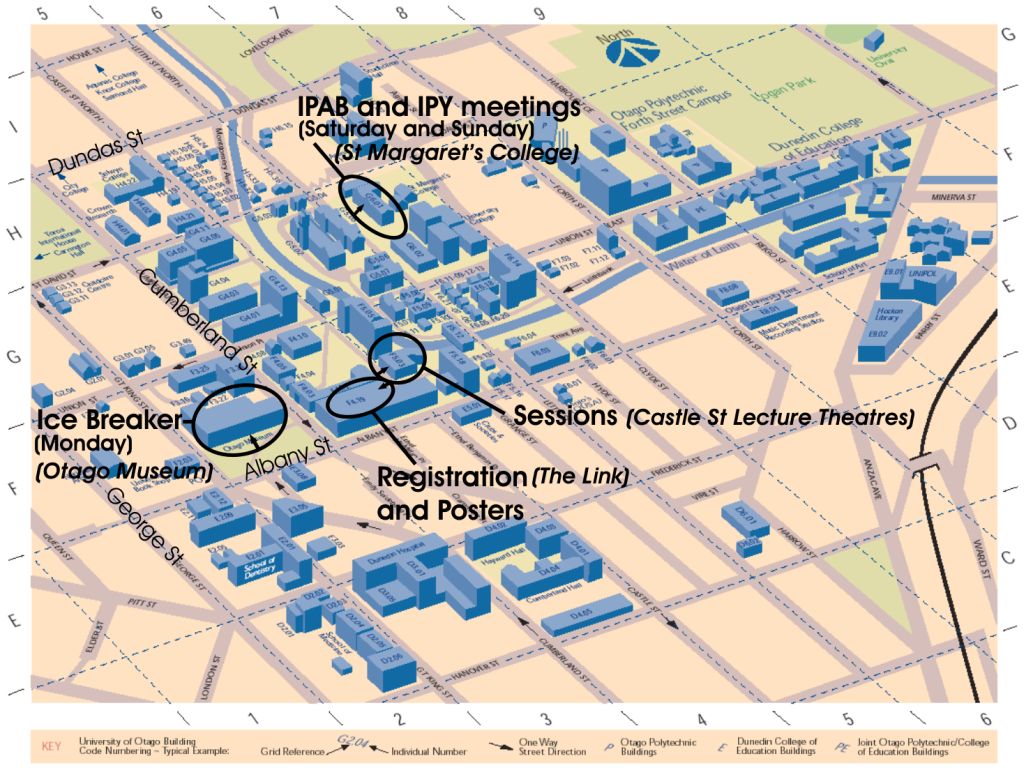 The cadastral map example for this purpose was for travel. The design allowed for visualization of the campus and surrounding streets for travel.
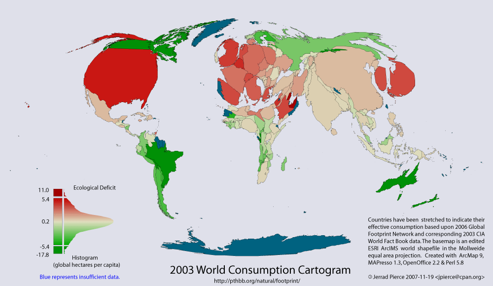 The theme of this cartographic representation is visualizing ecological footprints of nations. Red represents deficit and green represents reserve. Blue is missing data, and countries appear normal size as if in ecological balance. These type maps help gain attention to a cause by their startling expressions of differences among nations.
